Living Space Feature
Colour Infusions
Clare Hunt steers us towards making the right interior colour choices for 2018
Clare Hunt
1 January 2018
Living Space Feature
Clare Hunt steers us towards making the right interior colour choices for 2018
Clare Hunt
1 January 2018
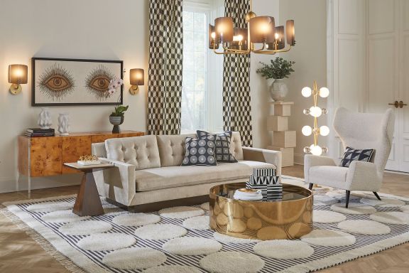
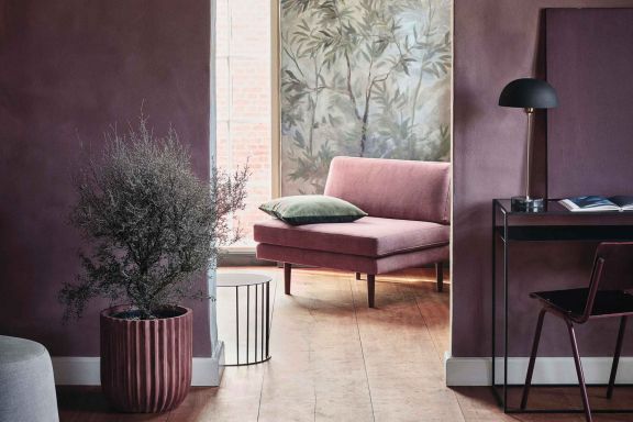
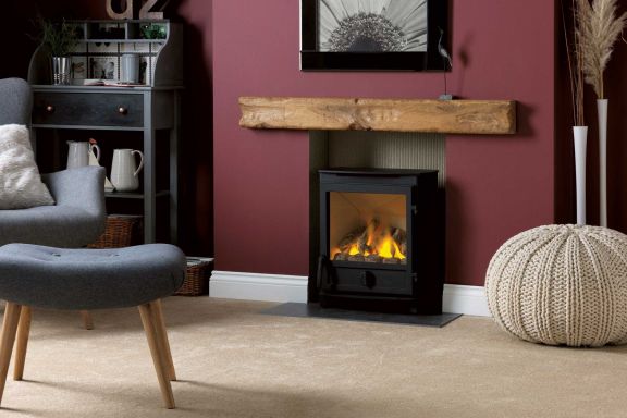
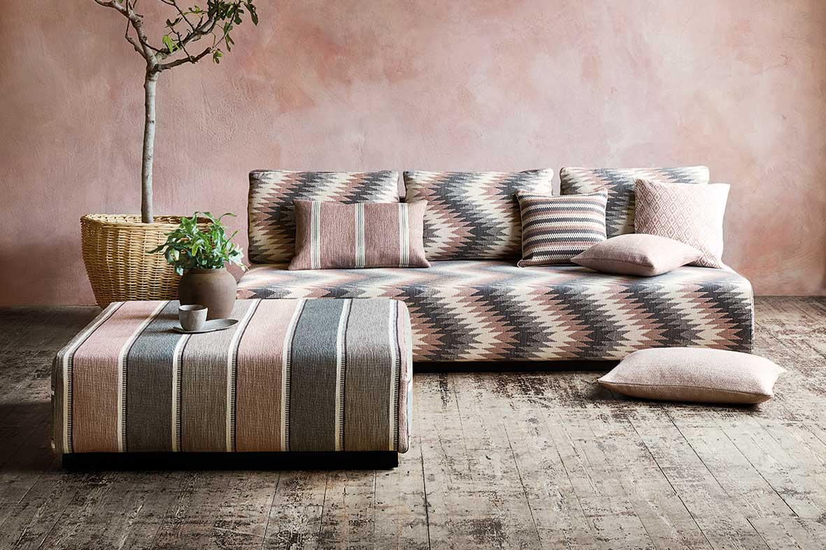
Step aside, Barbie – pink is riding high in the colour charts, but girlie it is not. From the gentle embrace of old rose to powdery tones subtly underpinned by warm grey, pink has grown up, developed new-found sophistication and become the colour of contemporary sanctuary. While retaining its longstanding crown as queen of the boudoir, pink has also carved a niche in the living room when punctuated by aubergine purples, or in the kitchen with contrasting pistachio greens and indigo blues.
Picks of the palette: Heart Wood – a delicate, enveloping shade of pink – has been named by Dulux as its colour of 2018. Meanwhile, Farrow & Ball has introduced Peignoir, a so-smooth hue inspired by the classic colour of silky negligees. Soft furnishings needn't miss out on the pink revolution: Romo's Soraya collection of upholstery fabric takes inspiration from folk designs and twins dusty pink with grey – its new best friend – in the Briar Rose colour-way.
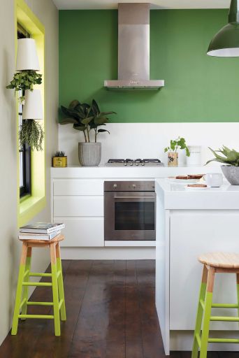
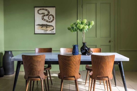
Green may have been the 'it' colour for 2017, but it hasn't fallen from grace with the turn of the new year. Where it was refreshing and invigorating, expect your 2018 greens to be reflective and harmonious. From mossy, delicate tones of sage to deep, almost decadent forest shades, layering green-on-green creates verdant intensity. Or offset a bold, statement green with blue-greys or sandy neutrals to soften the edges and create an inviting, calming scheme.
Picks of the palette: versatile Enchanted Eden from Dulux can be partnered with other greens for a heart-of-the-forest feel, or made modern when combined with grey purples or canary yellows. Canton from Little Greene injects a hint of turquoise for a grown-up take on deepest green, while Fired Earth's Dinner at 8 wallpaper in Summer brings nostalgic glamour to botanicals.
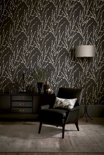
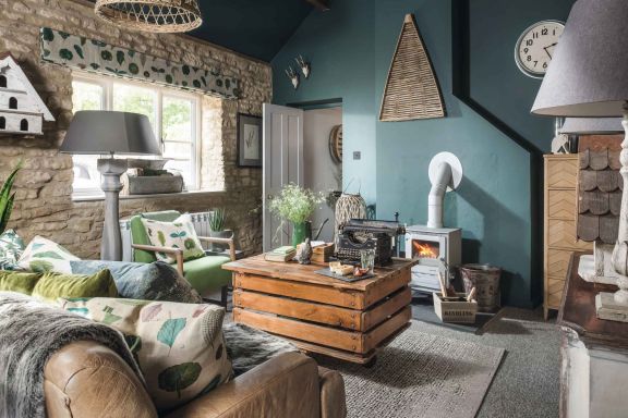
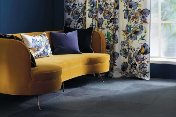
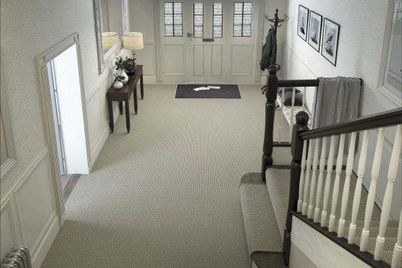
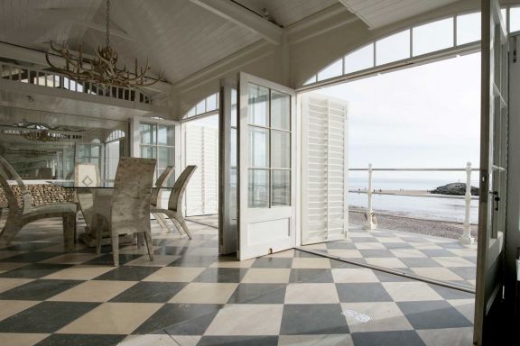
The deepest darks have been around for a while and, if such a thing were possible, promise to become even darker and more dramatic. Feature walls are so passé – if you're brave enough to go dark in 2018, take it across all walls and onto the woodwork, too. Inky charcoal and moonless midnight blue take the edge off black, with powdery finishes adding texture and intensity. Evoke a sense of period authenticity by offsetting with gentle grey neutrals, or make a dynamic modern statement with sparkling white accents.
Picks of the palette: Damson from Craig & Rose brings conker warmth to deep brown, while Fired Earth pulls no punches with uncompromising Charcoal. Romo's Mikado wallpaper in Charcoal uplifts inky matt black with a lively pussy-willow pattern.
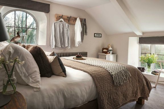
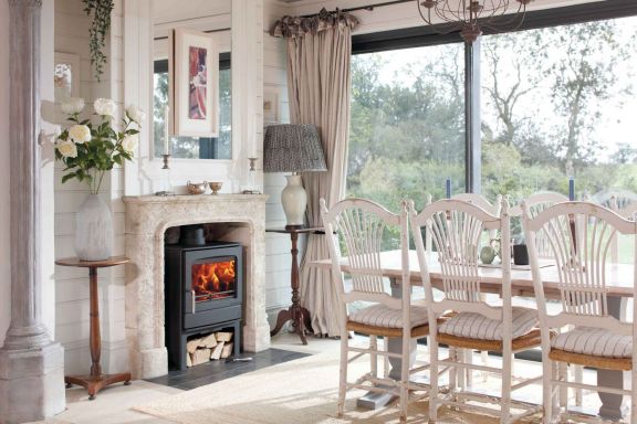
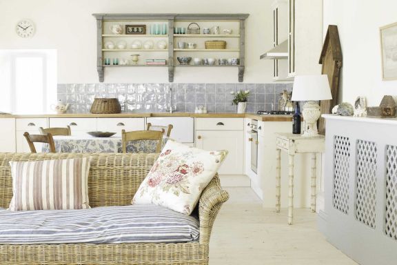
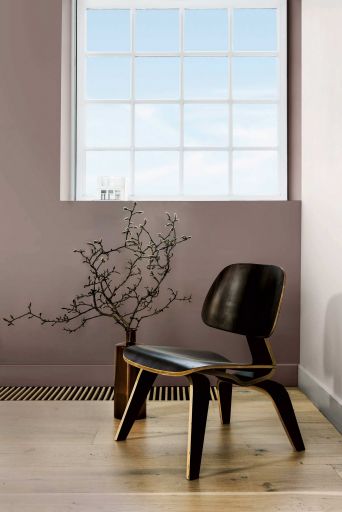
Unless you've had your head in a hole for the last 12 months, you'll have heard of hygge. The snuggly notion of Nordic comfort has moved on a bit. Folklore and kinship inform new ideas of intimacy and cocooning, with softly washed neutrals pairing with duck egg and berry hues for earthy calm enlivened by warmth and natural interest.
Picks of the palette: rich and chocolatey, Salon Drab from Farrow & Ball brings immediate warmth and comfort to small rooms. Rolling Fog from Little Greene has a similar wrapped-in-fur feeling. Laura Ashley's Silver Birch or Cottonwood fabrics reflect a less austere take on cocooning by combining natural prints on neutral backgrounds with a refreshing touch of blue-green duck egg.
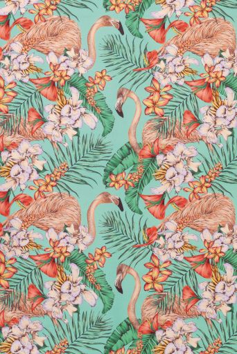
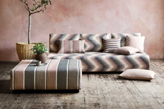
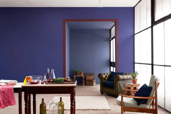
At the other end of the spectrum, there's always space for some in-your-face brights. High-definition primaries vie for attention with sun-soaked acids. Stay just the right side of clashing by combining deep orange with vivid gentian purples or vibrant fuchsia. Open-plan, 'zoned' spaces lend themselves to bold blocks of colour that could be overwhelming in more confined rooms.
Picks of the palette: Fired Earth's Festival Orange has perfect juicy attitude, while energetic Lamplighter from Craig & Rose delivers a big punch of yellow that's just the right side of warm. If you don't fancy dressing the whole room in shocking tropicals, inject a touch of playfulness into curtains or furnishings. With a cerise and orange feather print, Osborne & Little's Plumas fabric can be relied upon to get the colour party started. As can its Flamingo Club fabric. Not only does it combine luscious mint green with orange-pink coral, it also features actual flamingos. And you can't argue with that.
Annual subscription: £10
Single Issue: £5
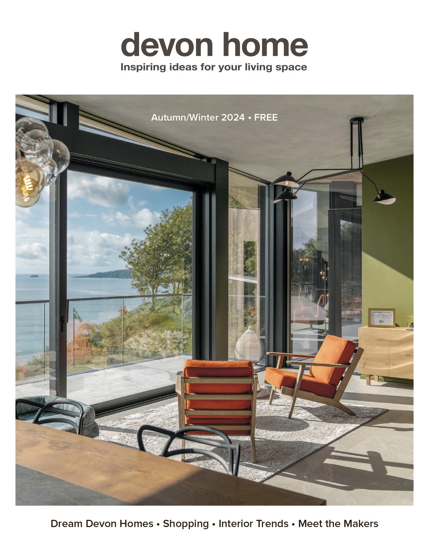
AutumnWinter24 issue out now
Try before you buy. View digital edition
Publishing Enquiries
Jeff Cooper: 01626 871161
Editorial Enquiries
Jennie Cooper: 01626 871161
Advertising Enquiries
Joan Redwood: 07902 528001