Living Space Feature
Setting the Tone
Create your very own house of colour. Anna Turns reveals this season’s brightest trends
Anna Turns
1 March 2014
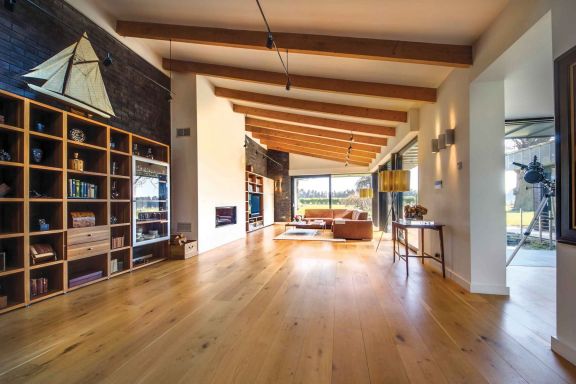
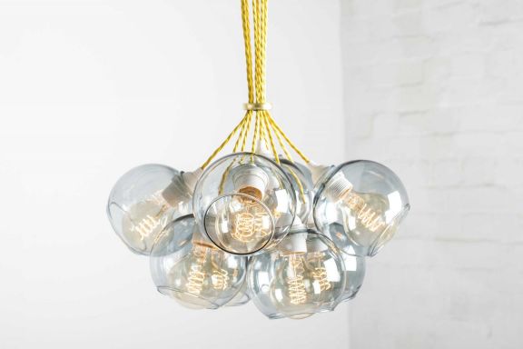
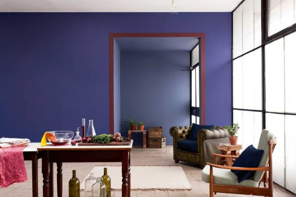
A splash of colour can transform your living space and set the mood for a room. Paint, fabric, furniture, flooring, lighting and accessories combine to create your colour scheme, so there’s more to consider than just how the walls should be decorated.
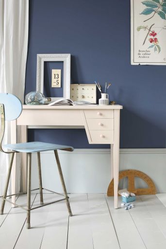
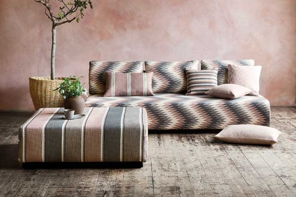
Colour creates an atmosphere and manipulates the perception of space in a room, making it seem significantly big and spacious or cosy and comforting, so it is important to decide how you want each room to feel. A hierarchy of colours is crucial for a balanced scheme, with one main dominant colour, accompanying tones, plus accessories in one or two accent colours.
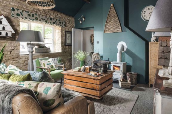
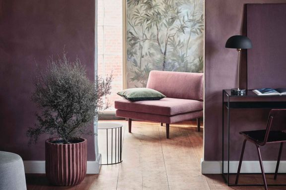
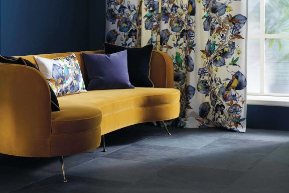
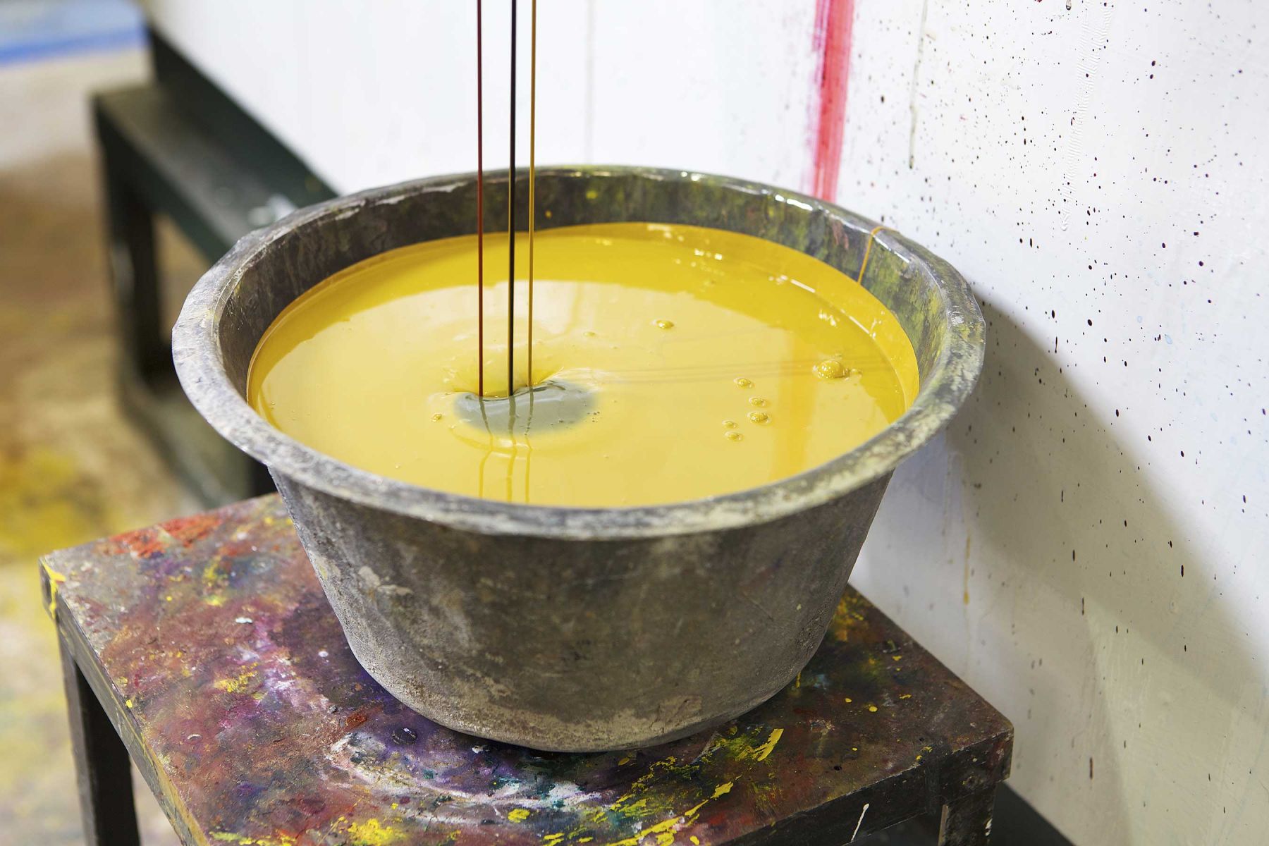
Regarding colour trends for 2014, Dulux’s Colour of the Year is teal (as featured in our January/February issue), while Pantone has opted for radiant orchid pink. Neutrals are inspired by natural surroundings; for example, hemlock, an olive-green shade is reminiscent of springtime foliage, and sand gives a warm, comfortable beach feel. Other key neutral base tones include placid blue and violet tulip, while subtle greys are mixed with a sharp acid lemon yellow for a modern palette. In contrast to these neutral tones, dazzling blue adds sparkle and cayenne adds a dash of spicy red energy.
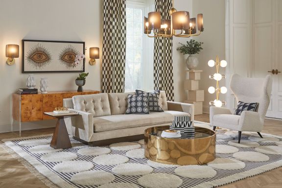
The industry’s colour experts create ‘trend stories’ for each season, taking into account art, culture, what’s hot on the catwalk and landmark global events such as the Olympics. Interior designer Rebecca Dupere, owner of Modbury-based Dupere Interior Design, explains one of the key fashions for 2014: ‘herald’. “Think pageantry, medieval with a 21st-century twist and bold pictograms. Imagine a rich palette with mustards, red, wood green and gold.” Rebecca also describes ‘axis’, another trend encapsulated by nature’s angularity, using chalky organic colours, greys and matte smoky black.
“Interior design has to suit your personality as well as the room’s surroundings, so let sea views or characteristics of an old house inspire you,” Rebecca advises. Once a trend hits the high street, it’s perhaps too mainstream for those ‘early adopters’, but Rebecca believes that there’s no need to slavishly follow every popular style. “If you buy great design in a good colour scheme, it will be timeless.” Make a feature of what you love in the room already, so hook a new colour scheme around a favourite painting, an upholstered antique chair or original flooring tiles, for example.
Caroline Palk from Ashton House Design in Ashburton says: “We feel that tangerine and taupe, or burnt orange and olive green are the most current blend for the spring/summer.” Ashton House Design has used this scheme in the interior of the Thurlestone Hotel and is also using it in its own showroom, which is undergoing a spring revamp. “Other thoughts are to start with a contemporary painting and build a scheme around it. Brave brush strokes in Chinese yellow or candmium orange all inspire interior schemes with gravitas. Having just commissioned a local artist to produce a triptych of scale, we are all in favour of this creative path and love the resulting interiors.”
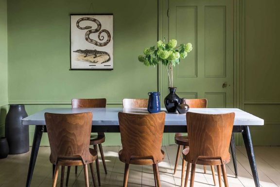
Farrow & Ball’s Sarah Cole explains how colours impact on the feel of a room. “Red tones create a sense of warmth, green tones a natural fresh feel, yellow tones a cheerful environment and blue tones often evoke feelings and memories of being by the sea.” Farrow & Ball’s four 2014 trend colours take inspiration from nature to create comforting environments. The organic Cooking Apple Green and more earthy Mole’s Breath are inspired by natural countryside landscapes, while Stiffkey Blue and Purbeck Stone take their inspiration from the British coastline.
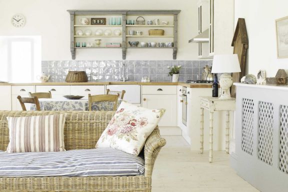
Have fun with introducing colour to your kitchen, either as a soft accent or a bold statement. Green hues help to bring some of nature back into the home, especially if you have a kitchen that looks out to a garden. “Mizzle is a beautiful grey-green that could be used on your cupboards to complement a neutral shade on the wall, such as Dimpse,” says Sarah. “Pigeon is another easy-to-live-with colour, though darker than Mizzle but with the same calm, grey properties and ideal for painting a kitchen island.”
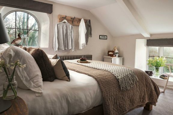
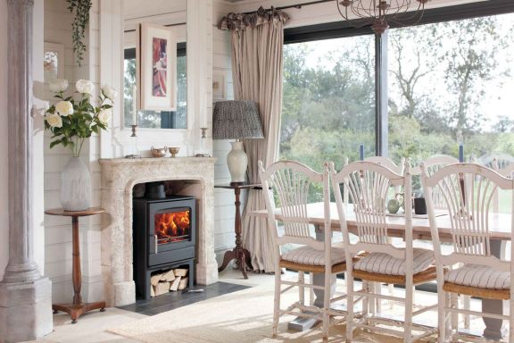
A thoughtfully co-ordinated living room should be a relaxing retreat after a hard day. Sarah explains: “Choosing warm colours, such as Terre d’Egypte, India Yellow or even Brinjal creates cosiness, whereas pairing warm neutrals results in a more tranquil space.” She advises choosing soft, soothing colours for your bedroom to ensure a relaxed, calming environment. “Muted shades work well,” she says. “For a feminine feel, try painting a bedroom in Middleton Pink with a Cinder Rose ensuite, or for a more masculine room, use Hague Blue in the bathroom alongside a Skylight bedroom.”
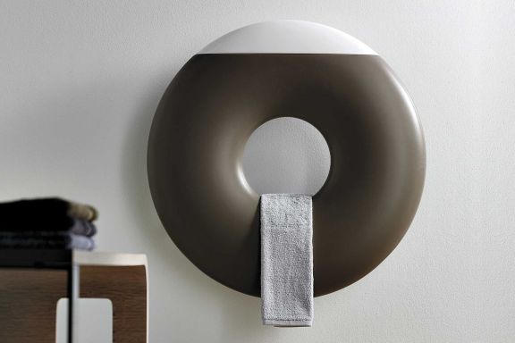
Small bathrooms and downstairs toilets with little natural light offer the perfect opportunity to have fun with bold colour: “Use strong warm shades, such as Pelt or Plummet, to create a dramatic yet intimate space,” suggests Sarah.
If you have a blank canvas and you enjoy keeping up with ever-changing fashion trends, choose floorings and key pieces of furniture in neutrals, so it’s easier to change the feel of a room with a fresh hue on the walls and different accessories. Paint may be simple and accessible, but you can also brighten up plain walls with statement artwork, a collection of bold photo frames, coloured radiators or designer patterned wallpaper. The combinations are endless so be imaginative. Whatever you go for, enjoy finding the colours to suit your personality and your home.
“If you buy great design in a good colour scheme, it will be timeless”